
A closer look at the Linus Health brand evolution
You may have noticed something different about Linus Health lately: we’ve updated our branding.
Back in 2019, we embarked on a bold journey to bring brain health into its rightful place in the standard of care and make it accessible to everyone. Our refreshed look is a testament to our deepened dedication to this mission.
With this brand refresh, you will see new photos, graphics and fonts that reflect this renewed commitment while honoring our history. The new branding celebrates our groundbreaking cognitive assessment platform as a powerful and efficient tool designed for providers to help identify their patients’ early signs of mild cognitive impairment that, at the same time, delivers potentially life-altering news to patients. As such, it represents the sincere understanding of the pivotal role our solution plays in patients’ and families’ lives, and the empathy we have for them as they begin their care journey.
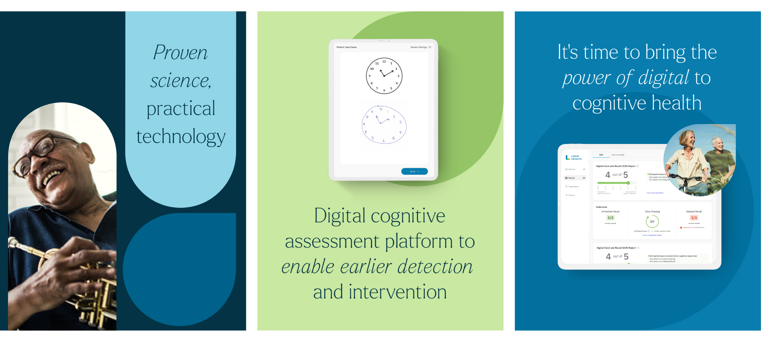
Our refreshed brand reflects our continuing commitment to bringing the latest research into the challenging, yet impactful world of primary care — the frontlines of healthcare. While our technology is powerful and proven in more than 50 studies published in peer-reviewed journals, what makes it so impactful is its practicality. As such, the updated brand also aptly reflects our purpose to transform brain health for people across the world by removing barriers and expanding opportunities for quality cognitive care.
This advancing maturity of our brand and unwavering patient care mission are communicated through a blend of the familiar and new. We teamed up with the design agency Atomic Health to reimagine our brand, striking a balance between honoring our roots and propelling our story forward. Every aspect of our new identity has been crafted to more accurately reflect our mission and the uniqueness of our solution. With the help of the creative and development team at VisualBoston, we brought this vision to life on linushealth.com.
You'll notice both new and updated visual elements across our website. We've adjusted how we use our blue and green palette to enhance the impact and feelings these colors evoke. We've also introduced new typefaces to help our words resonate more deeply as we aim to improve the lives of patients and their families.
You’ll start to see our new look more and more as we gradually update our branding across all of our collateral. Rest assured, while our look may have changed, our core commitment to you — our valued customers and our community — remains the same.
We’re genuinely excited about the possibilities this new branding opens up for connecting with you and our broader community in more meaningful ways.